Ux Design – Numiphy
Numiphy is a UX Design project for a child weight management app.
The idea came after personal experience with nutritionists and with a complete change in my eating routine. With 2 small children at home, I realized the need for apps with this focus on the market.
I started the work through research on obesity in the world. The data is frightening: According to the WHO, 13% of adults in the world are obese. 39% of adults in the world are overweight. One-in-five children and adolescents, globally, are overweight. Obesity is determined by the balance of energy intake and expenditure.
Goals
Before launching the Numiphy app and website, it is necessary to understand whether the existing services are sufficient and interesting for the user to use the tool or whether there is a need to include other modalities.
Responsabilities
Conducting interviews, paper and digital wireframing, low and high-fidelity prototyping, conducting usability studies, accounting for accessibility, iterating on designs and responsive design.
Persona
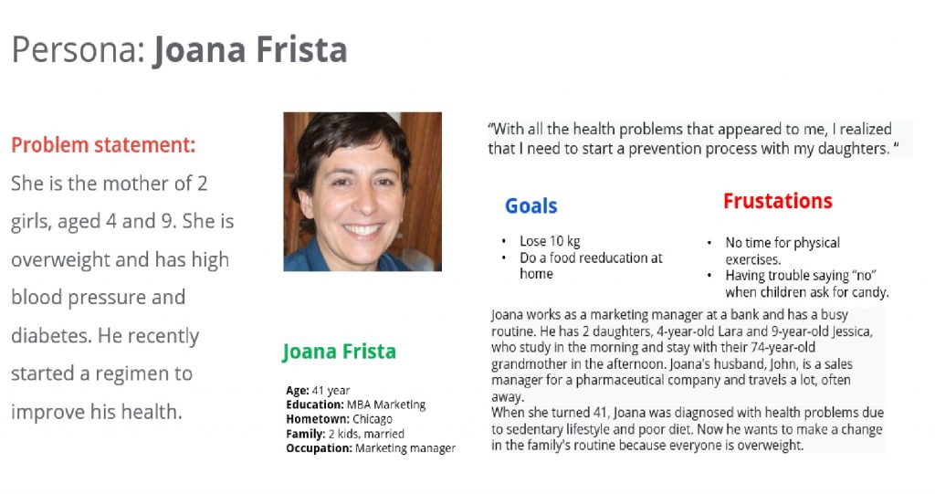
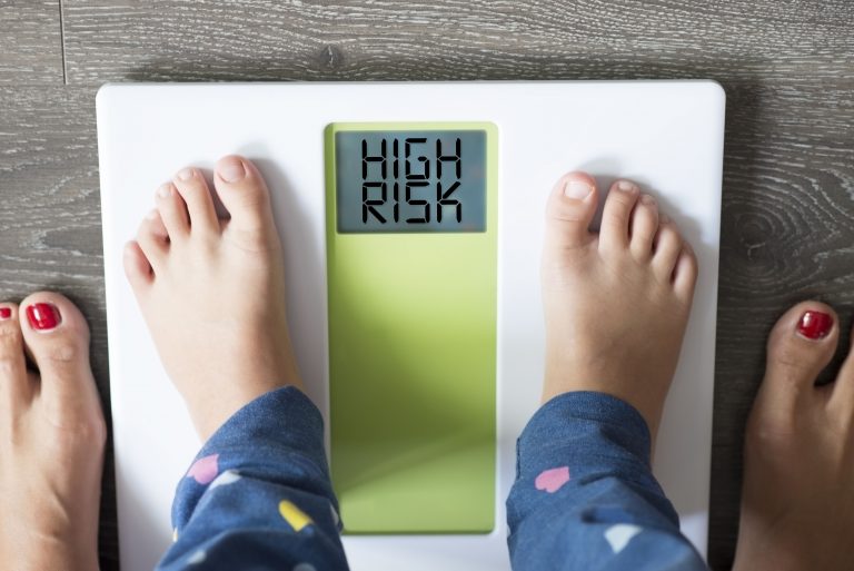
Numiphy is a project for children, but we know that the person who hires the service is always an adult who is responsible for a child with obesity. And in the vast majority the problem is familiar, it is the lack of good eating habits, hereditary health problems and lack of physical activity that cause a general context of family illness. With this data collected in studies on the subject, we created a persona, the hand of a child with obesity.
Wireframes
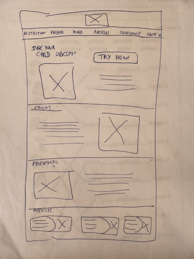
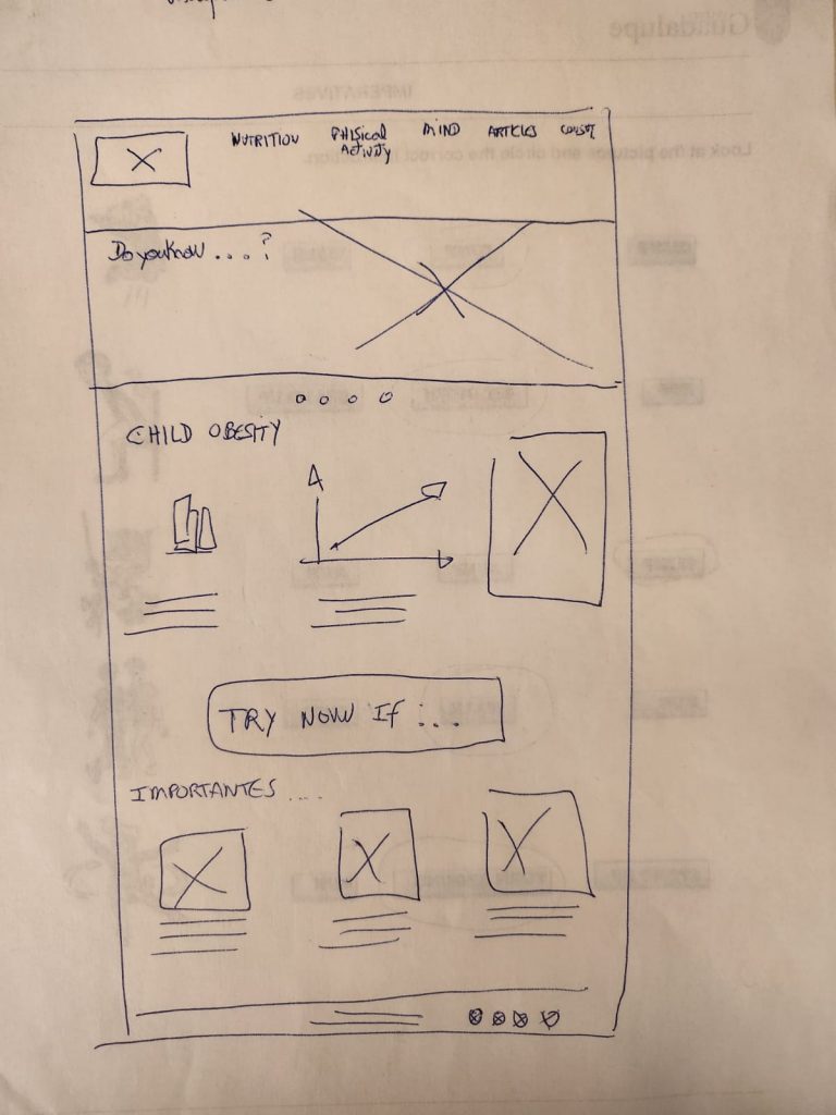
With the site mapping, I started drawing ideas on paper of possible wireframes. This is an interesting brandstorming process where I thought of possible layout ideas. When analyzing the persona, I decided that the public needed something more traditional, those looking for services are in a fragile moment and something very innovative can scare the user. On the other hand, the information needs to be very clear and intuitive to generate trust and acceptance. I perfected the home screen paper wireframe variations for the right focus on optimizing users’ browsing experience.
Digital wireframes
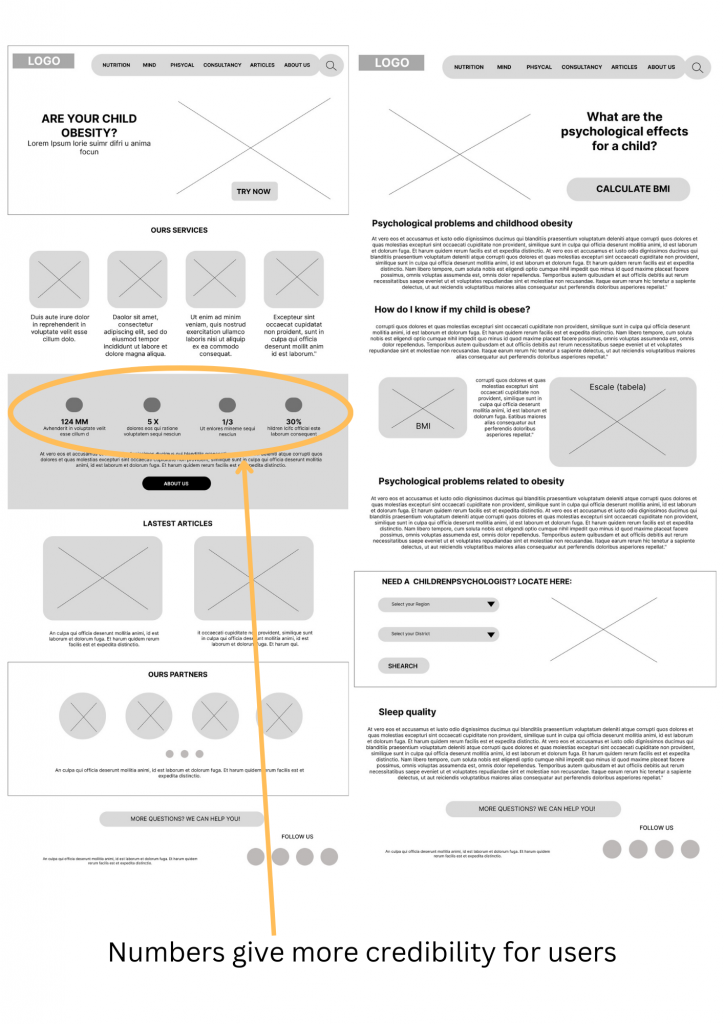
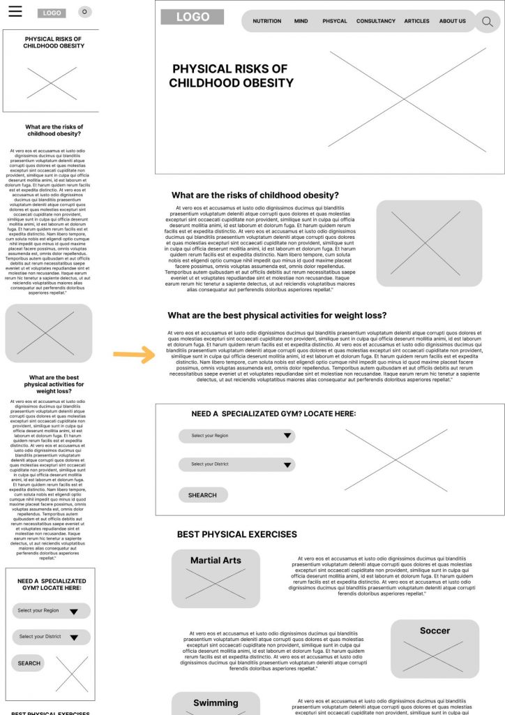
Moving from paper to digital wireframes made it easier to understand how redesign could help solve user pain points and improve the user experience. Prioritizing useful button locations and placement of visuals on the homepage was a key part of my strategy.
Digital wireframe screen size variations
I started the project with the website size. Doing the minimize process for a smaller device is a relatively easier job than controlling the reverse process.
Low-fidelity prototype
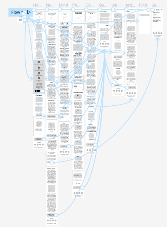
It was necessary to connect all screens of the main stream in the 2 low fidelity prototypes (web and app). During this process, I received feedback from a few people about page organization and pain points.
Site map
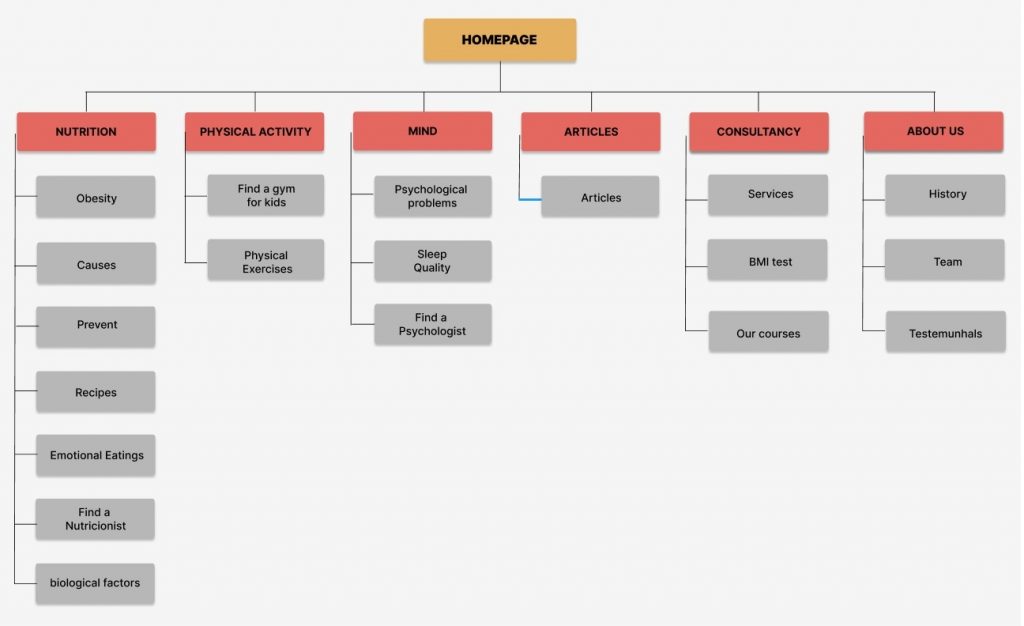
My goal here was to make strategic information architecture decisions that would improve overall website navigation. The structure I chose was designed to make things simple and easy.
Usability Study
Conducted user interviews to understand the attractiveness of the app and website to the user. After the interviews, I created empathy maps to better understand the target user and their needs. During the interviews, we verified that there are no such tools on the market, which greatly attracts the user, but there is no culture of “obesity treatment”, and it is believed that the child grows up and that the problem disappears.
Through the study we reached the following points:
- HOME – As it is not clear whether in the process we should focus on the 3 modules there is a need to have an additional page with the step by step of the ideal process. Changing the name Físico to Body was also a point raised.
- SPECIALIST – For the process, include specialists who make a pre-contact with the user. Include the most visible contact links on the pages.
- PRICE – Having a page with prices gives more credibility and removes previous doubts from users.
VISUAL AND BRAND
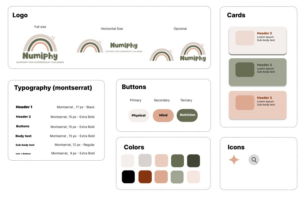
For the creation of the brand, i had in mind a symbol that recalled childhood but at the same time, to nutrition. The rainbow was the chosen symbol, which refers to hope and good results. The challenge now was to get away from all the colors of the rainbow that make it difficult to focus on design and end up making printing processes more expensive, for example. The choice of colors more oriented towards pastel was right when I realized that they matched well with the theme. Since the beginning of the project, I thought of separating the process into 3 main pillars: Nutrition, Physicality and Mind and linking colors to the modalities to facilitate identification and maintain a harmonious visual identity.
It also includes in the symbology the stars above the rainbow that refer to overcoming and health. The font used for the logo was also more child-friendly, in harmony with the rainbow, a sans serif font and calligraphy.
Mockups
With the wireframe already defined and the necessary changes after the Usability Study, we used the visual identity to create the mockups.
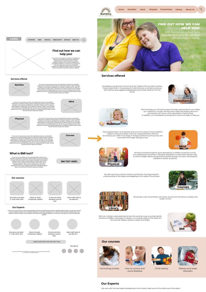
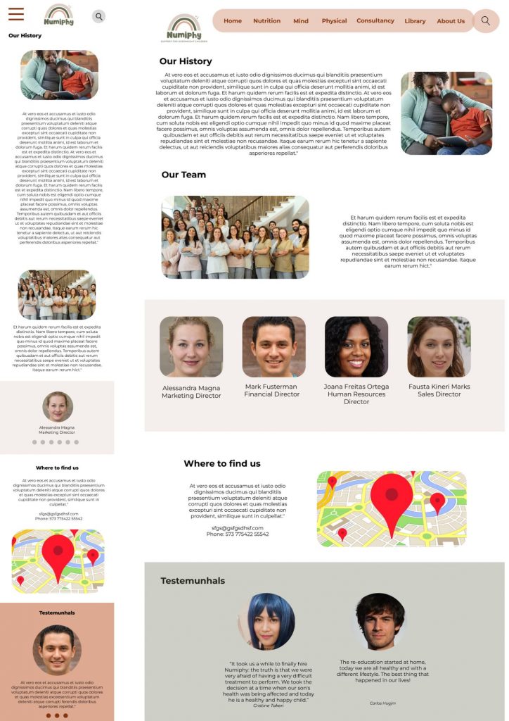
You can to acess in figma this mockup: https://www.figma.com/file/I0Eh74nkxuzRMrF5oN7Rqg/Website-Child-Obsity?type=design&t=X5oAmALhuazDtHjz-1
Takeaway and next steps
So impacts, i found the navigation proved to be intuitive and easy to navigate through the tests performed. The photos and division of colors by modality help to identify the themes . I learned that greater transparency in relation to the costs that the user.
How next steps, i will to incluse of page with prices and step by step. More visibly include links to experts on all pages. After, i will to identify any additional areas of need and ideate on new features.
